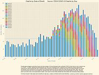
Chartology 101
Media scare chart: Media loves these day of reporting charts, makes things look really bad, even though the headlines screams "deadliest day ever" all the deaths did not happen that day, most were earlier dates

Charts scientists and epidemiologists use are based on date of actual death. See the difference?
Same chart without the colors (from Florida Dashboard)
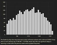
CDC also uses more scientific date of death charts. Anyone who try's to tell you the media charts are scientific is clueless. When the media says Florida is the next New York they are clueless too.